|
|
Post by patriot on Apr 18, 2008 13:03:05 GMT -5
Ok, some background. I'm on a sports design board, and they were running a tournament. The focus was to take preselected names and give them a visual identity. I ended up with the Austin Stars. The first round was to create an initial logo package and uniform set. 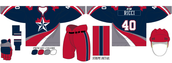 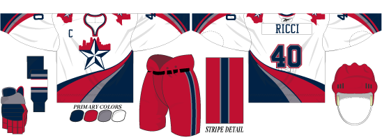 The logo is the traditional "Texas Star", with the Austin skyline in the backdrop. The jersey striping is supposed to be reminiscent of the Travis River that flows through Austin(while also being the Ducks template lol). For the second round, it was create an alternate jersey, which I made a "fauxback" using the same pieces of the original identity but in a more traditional classic style. 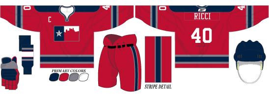 For the current round that I'm actively engaged in, it was to create an anniversary patch(as it's supposed to be the Stars' 20th anniversary in the league). For it I took a lot of the same concept but also took some idea from the WrestleMania 20 logo.  This was all done in Illustrator, obviously. |
|
|
|
Post by garrett on Apr 18, 2008 13:18:44 GMT -5
nice. i like.
very professional. my only gripe is that it seems like there's too much going on in the star.
|
|
|
|
Post by Parchandri on Apr 18, 2008 15:42:49 GMT -5
That's awesome man. Very well done. So professional and such a realistic style and feel.
|
|
|
|
Post by mkm24 on Apr 20, 2008 9:43:32 GMT -5
Salivates.
Good stuff Patriot.
I need illustrator in my life. :]
The white unis are my favorite
|
|